The OPEN MARKET font

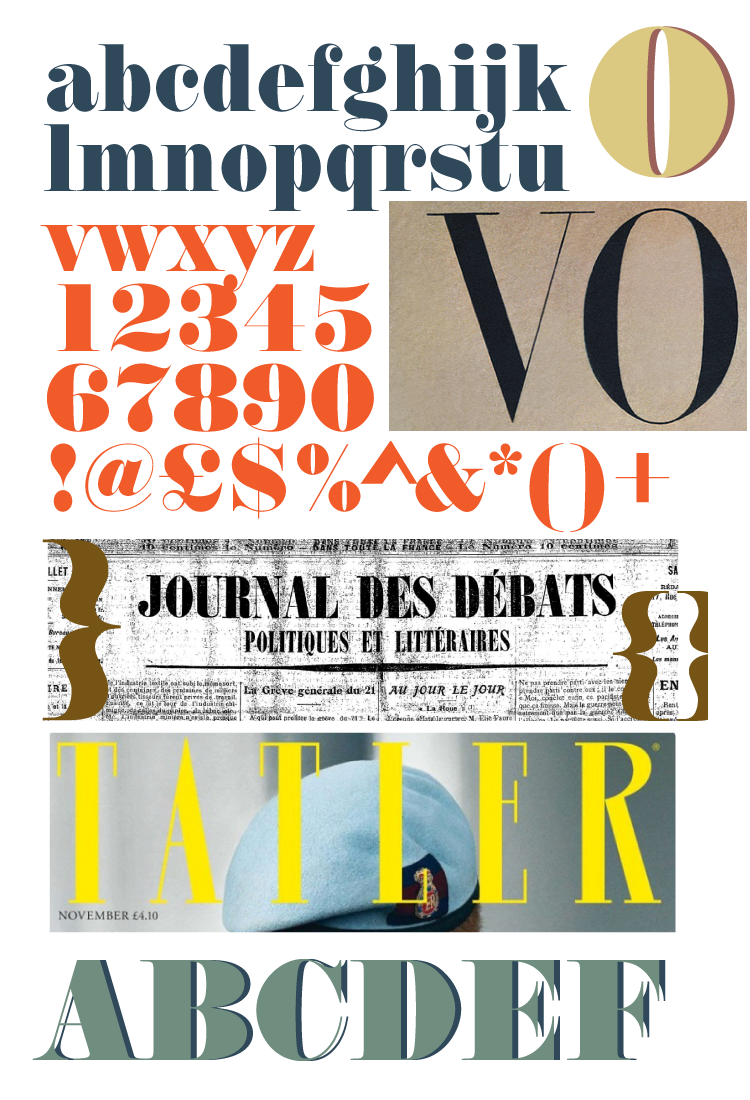
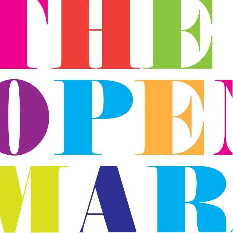
The font I chose for Brighton’s OPEN MARKET arches is Annlie extra bold
Annlie is a fabulous font and was chosen for practical and cultural reasons.
PRACTICAL On the practical front the “holes” or counters in the letters extend right to the edges of the letter so that there is no floating parts. The wide horizontal spaces highly are contrasted and balanced with hairline opposing stems. This leaves plenty of room for the decorative work. The crossbars and serifs are horizontal meaning that they are easier to fabricate and will provide decent footings for mounting.
HISTORICAL Annlie is from a family of fonts known as Didones, developed initially by Firmin Didot in the 1780s. The font Didot itself is described as neoclassical and regency, and is evocative of the Age of Enlightenment. Didones were revamped in the sixties especially for magazines, think of Tatler, Harpers Bazaar, and of course Vogue. Annlie was deigned by Fred Lambert in 1966 for Letraset. Annilie is what is know as a Fat Face,- modern offshoots of Didones and in this case an exaggerated form, that still maintain elegance.
BRIGHTON Annlie is a sixties optimisation of old Regency advertising typefaces. Annlie’s fine thin strokes are very graceful in their appearance, and give a strong, yet soft, feminine feel. A sixties revival of Georgian typeface is fitting for a Regency Seaside town.

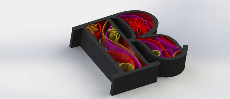
3d Render by Rob Newmarch

and a possible new logo for Lucid Design!

Share